Tim Toggs is a YouTuber who created his channel to talk about different technologies, software, and other things that he finds interesting. He has been in the sales industry for a while but wanted to help people with their efficiency in life and at work.
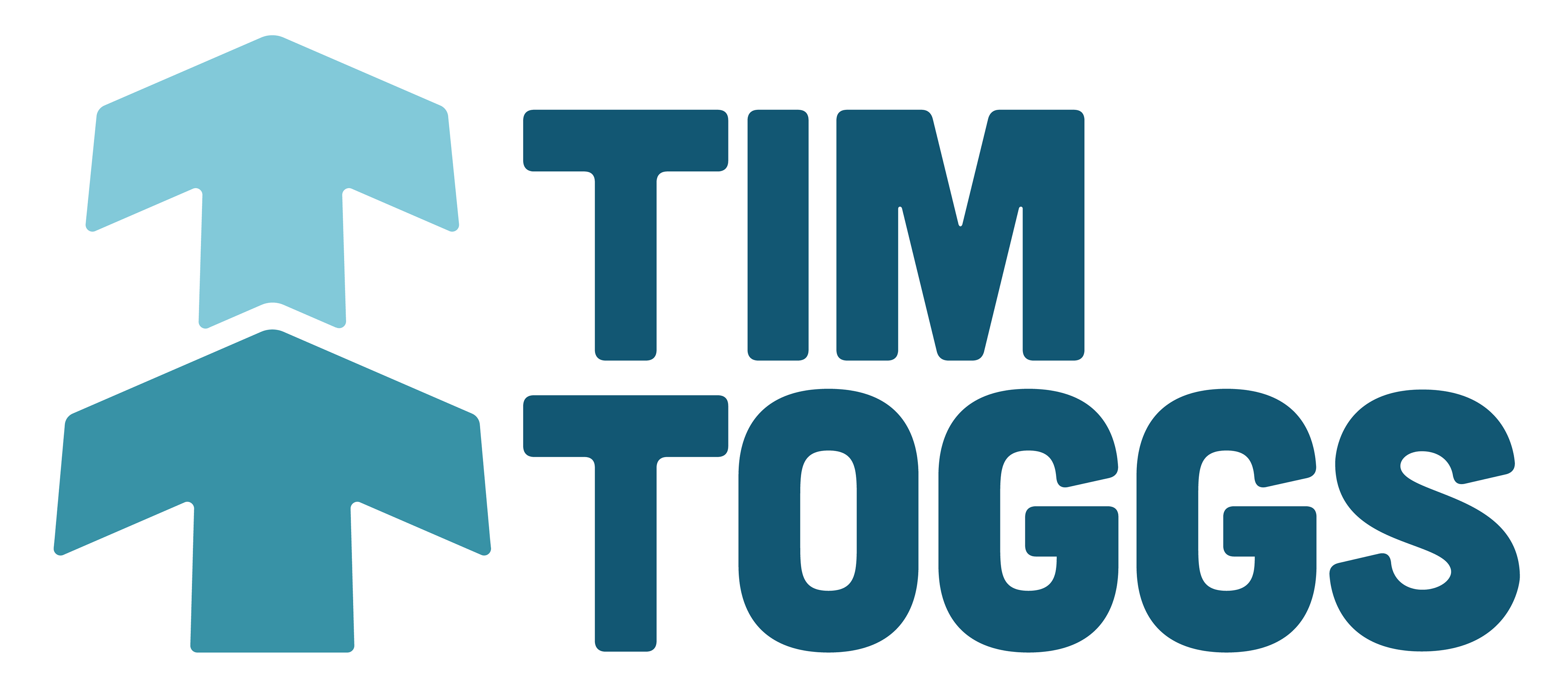
For his logo, Tim suggested an acronym logo (TT), and he stated he was a fan of minimal designs and the color blue. Tim also mentioned that he was from Colorado, and he would like to see some sort of outdoorsy vibe! This logo was one of the options I presented to Tim that included all of those ideas! This logo is a TT acronym logo, arranged in a way to look like a tree or a stack of arrows representing progress. It includes the color blue, and a sort of outdoorsy vibe, utilizing the Cubano font that tends to give off a similar vibe.

Linkedin Banners

"So happy with my logo & brand design - Lauren did excellent work, was super responsive and communicated clearly. She took my ideas and made them a reality. Highly recommend working with Lauren on any branding & logo design needs!"
-climbtomillion on Fiverr